DNEG’s VFX Supervisor Aymeric Perceval and MGFX Supervisor Guy Hancock give us a closer look at the studio’s work on the new Apple TV+ anthology drama series.
What scenes were DNEG responsible for? How many shots did you complete and how did you achieve them?
Aymeric Perceval:
So many! As the main VFX partner, DNEG took on a significant role in the production of Extrapolations. We worked on 880 shots and 162 assets, spread across 171 sequences and 7 episodes, resulting in 98 minutes of VFX in the final edit.
Our MGFX team, under the guidance of MGFX Supervisor Guy Hancock, also provided an extensive array of graphics which were required in approximately 55% of the shots and 42% of the assets, making their contribution invaluable.
The narrative presented a unique challenge, with its diverse range of characters and ever-changing locations spanning a 33-year period from 2037 to 2070. Unlike traditional shows, this meant we couldn’t rely on reusing assets throughout the entire season. Instead, it provided us with an exciting opportunity to explore a wide array of visual effects, from subtle touches to eye-catching spectacles. Each of our departments had the chance to shine and deliver standout sequences.
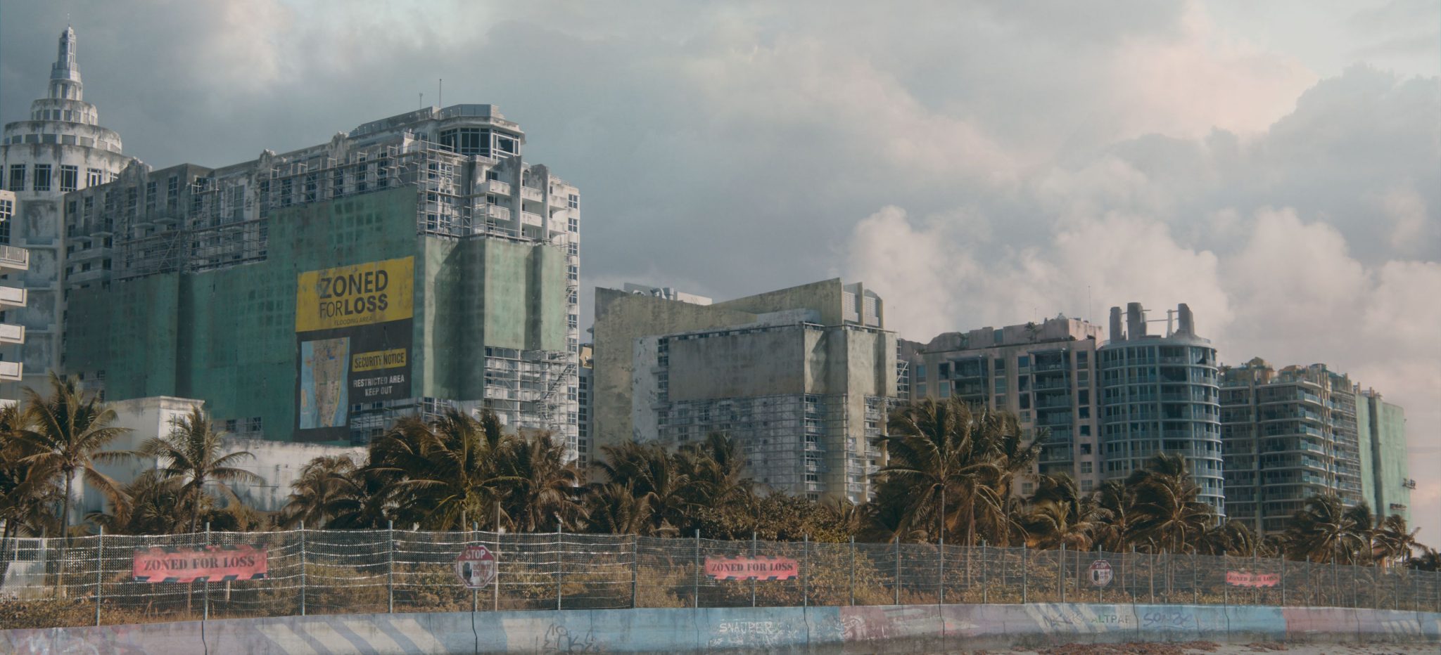
While a portion of the work involved transforming various New York locations into different places around the globe, the majority focused on helping Showrunner Scott Z. Burns and Production VFX Supervisor Ashley Bernes express their vision of the world we might be heading to. We tackled everything from portraying the effects of global warming on our dwindling ecosystems, to adding futuristic elements that guided viewers through the narrative.
Our teams delved into creating and animating the last remaining animals on Earth, crafting stunning CG environments underwater, on land and at high altitude, and simulating natural and geoengineered phenomena. Additionally, we generated hundreds of motion graphics to enhance the storytelling. The result is a treasure trove of both realistic and stylized work.
In total, our team grew to 740 people over our Montreal (which was the main hub), Vancouver, London, Mumbai and Chennai studios.
What was the biggest challenge of the process? What was the most difficult VFX sequence in this project?
Aymeric Perceval:
I’d say that episode four might have been the trickiest one. It was one of the last episodes that we worked on, but was also one of the biggest with 176 shots and each sequence having its own share of technical and creative challenges. And the climax of the episode was the release of calcium carbonate in the atmosphere which only appeared in a handful of shots.
The episode explores the concept of geo-engineering and raises the question of whether humans should be playing God by spraying tiny reflective particles in the stratosphere to cool down the planet. At first, I thought it was a total sci-fi idea but just a few days after watching the first edit of the episode, I came across an article about Bill Gates and a team from Harvard seriously considering doing exactly that. The amount of research that went into writing the show is impressive.
But here’s the thing with geo-engineering, as Edward Norton mentions in the episode: you only get one shot. There are no real photos or references to show what it would look like or what it would do to the planet. So, unlike creating a whale, a walrus, or even fictional drones, we couldn’t turn to real-world examples for inspiration. It was all up to our FX, lighting, and comp departments to bring it to life through research and development.
The storytelling objective was clear: delivery drones all over the world would suddenly zoom up to the highest altitudes they could reach in the atmosphere before releasing their payload of calcium carbonate. The effect would then spread and cover the entire sky. The real challenge was finding something believable yet visually stunning for this grand finale.
As a starting point, Ashley shared timelapse videos of SpaceX shuttles leaving glowing trails in the night sky of Los Angeles. We also dug into fallstreak holes, those rare circular gaps in clouds that form when water freezes suddenly, often due to human interference like an aeroplane passing through the clouds.
After considering the speed and altitude of the drones, we came up with a cool idea: a cone-shaped release of particles that spiralled and expanded, eventually transforming into clouds. To capture the reflective quality of calcium carbonate, the FX team worked closely with the lighting and comp departments, adding extra layers to create a soft rainbow effect, just like light bouncing off a prism. Once we nailed the look, we ran multiple variations and worked with the layout team to fine-tune the timing and positions, to hit the editing beats.
It took some trial and error to achieve the perfect balance between creativity and technicality. And we had to rely on our own sense of aesthetics to determine what looked visually compelling, knowing that we were venturing into uncharted territory.
Guy Hancock:
Certainly one of the most challenging sequences for the MGFX team was the Memory Decay shots in episode six. We needed to develop a look and technique that could represent the gradual disintegration and erosion of Ezra’s memories over the course of the episode. This was a crucial aspect for storytelling as it demonstrated the effects of the Summer Heart disease and the reliance Ezra has on technology to hold onto really important memories from his past, and really, his personality.
The effect required a methodology that could be applied to various memories in a plethora of settings, with different shot frames, light conditions and colour palettes. Crucially, there needed to be control so that the sequences could be quickly, but carefully, adjusted as the episode developed. Many shots would require comps to be completed first so the methodology needed to be as procedural as possible.
The real challenge came in trying to come up with an appropriate design that could be applied efficiently across a huge number of shots. Gradually, we refined our look and developed a sophisticated template that would allow us to apply it consistently across all these different shots. Unfortunately, we could only get so far, and the effect still required a huge amount of work from the team to carefully adjust several bespoke sequences ensuring we could hit all the desired nuances in timings, speeds and affected areas that the showrunners wanted.
Were there any particular pieces of instruction that stood out to you when achieving the VFX style?
Aymeric Perceval:
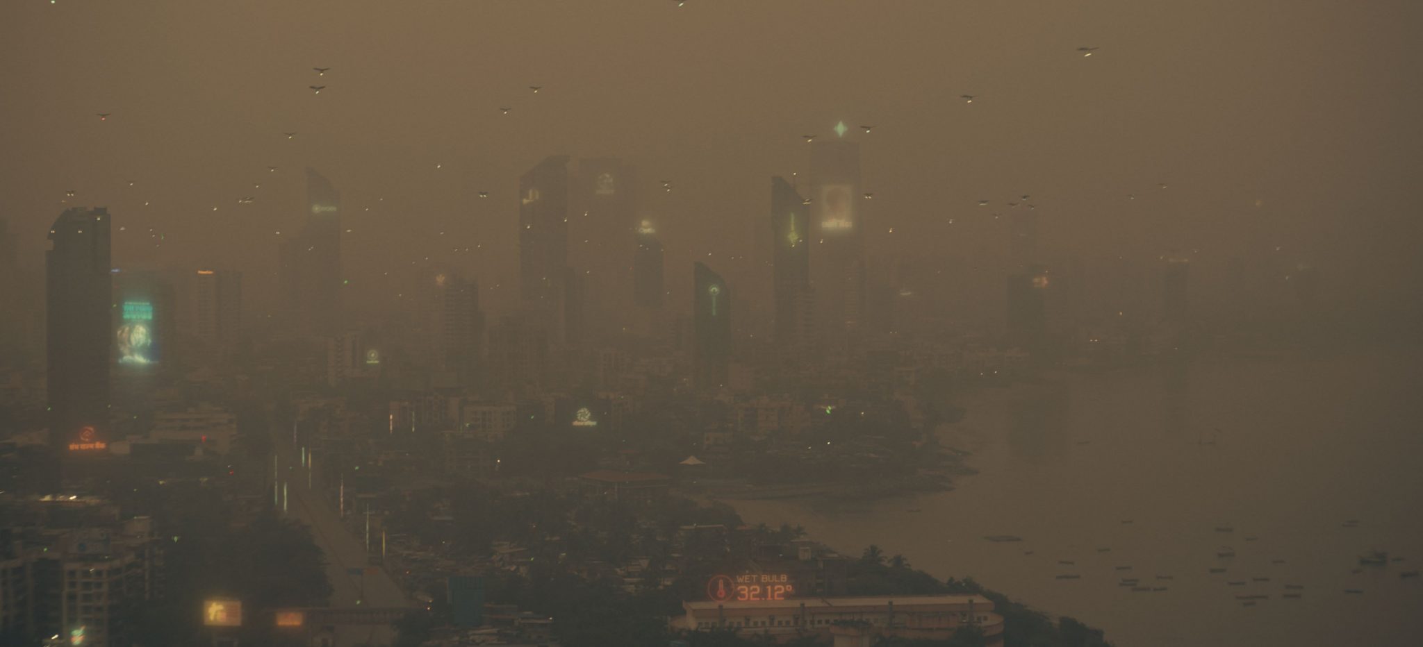
The objective for the VFX was to create an authentic photorealistic experience. However, given the context of global warming, it became even more crucial for our work to enable viewers to envision and comprehend the potential realities that lie ahead. Living in close proximity to constant forest fires or flood-prone areas, or enduring uncomfortably high wet bulb temperatures, how can we effectively depict such circumstances? Sadly, a simple scroll through the internet offers a daily influx of relevant references, so we knew what we had to match to.
When it came to the portrayal of various animals, Scott and Ashley desired sequences that resembled wildlife documentaries rather than Disney movies. Each shot had to strike a balance between real-life references we could find online and the envisioned actions, all while avoiding excessive anthropomorphism and over-animation of the animals.
Another directive we received pertained to depicting the future. Scott emphasised the importance of avoiding an overly futuristic feel too early in the timeline. Despite the expectations we held two decades ago, flying cars have yet to become a reality!
Consequently, our team in the build and environment departments ensured that our mechanical vehicles and infrastructure extensions remained firmly rooted in plausibility. However, MGFX provided an excellent avenue to explore the evolving relationship between displays, technologies, and ourselves over time.
Guy Hancock:
As Aymeric has mentioned, what was really interesting about the show was the unique timeline of the episodes which progress over the course of three decades. The showrunners really emphasised to us that they wanted to have a clear relationship with user technology and this timescale. The graphics had to make technology feel believable and consistent throughout the time and locations. The ‘vidscreen’ projection device, for example, is used in three of the episodes over a duration of nine years. We needed to make sure that visual style and designs had obvious nuances and ‘upgrades’ within the graphics and presentation to make it feel like there had been a believable progression in the technology.
These design considerations became even more intricate when we were also asked to take into account who was using the devices. A device sourced by the private tech giant Johnathan Chopin, for example, would be rawer with extra functionality and advancement. Whereas the same technology in episode six is now in a global commercial market which is used and available in most people’s homes.
This can be challenging as the nature of VFX is very non linear and we often work on episodes and sequences out of chronological order. Fortunately, episode six – which had the majority of these devices and a setting in the middle of our time scale – was worked on first and became our visual stamp. A considerable amount of concept work and lookdev was built around this episode, ideas and principles of which we could adapt back and forth throughout the rest of the series.
I feel that this instruction and attention to detail was crucial to building the world and making sure the whole series tied together successfully. It could have been easy to run away with hundreds of different concepts across the show, but we were steered to keep it very convincing and believable.
Were there any other visual inspirations for the project?
Aymeric Perceval:
Life! I remember, towards the end of the show, our Environment Supervisor was on summer holidays in France where massive forest fires started happening. While she was sending us her pictures, we couldn’t help talking about the way it was looking just like some of the shots we were working on. The show is going to stay with us for years to come because, even these days with all the images and videos of the orange smoke-filled skies in New York popping up in my various feeds, my friends are contacting me to tell me: “It looks just like Extrapolations!”
Other than reality-inspired VFX, Ashley had tons of references for the MGFX, but I’ll let Guy talk more about those!
Guy Hancock:
Even though Extrapolations is a sci-fi show, a sense of realism and authenticity was really important to us and the showrunners. From a graphics perspective, we tried to look closely at current technology and design and make sure our own designs were considered but with a futuristic twist. Generally, we try to keep abreast of trends across lots of art forms, technologies and mediums – you should see our Pinterest account! We always try to apply lots of considered ideas and creativity to produce unique concepts that still feel inspired and connected with current design.
Throughout the show, there are lots of fantastic devices that have important world building and storytelling functions. For example, Ezra’s media device which charges his monitor and shows the current severity for Summer Heart sufferers. Also the medical 3D printer which assembles his medicine. Really considering the device use, function and purpose helps to drive the visual style. We have an amazingly creative, skilful and experienced group of designers, and collaboratively we were able to capture a really believable future world while maintaining the essential storytelling.
How did your approach differ from other DNEG projects you’ve worked on?
Aymeric Perceval:
It was my first project with such a heavy emphasis on motion graphics, adding a refreshing twist to the adventure. During our spotting sessions, Guy would usually join me and Ashley, who always brought a bunch of references for the graphics he had in mind. We would discuss each shot’s action points and brainstorm on the spot..
Overall, the creative partnership with Ashley was truly enjoyable. Right from the start, he was always available and open to bouncing ideas off each other, even sometimes before the shots would be ready to brief. We first started with one or two calls a week, but by the end, we were talking every day. And let’s not forget the tons of emails! It truly felt like he was part of our team.
So, despite the various challenges that arose during the show, that easy flow of communication became a true asset, especially during the final stretch when requirements were evolving. It allowed me and Ashley to constantly reassess the scope and provide creative solutions while still keeping to the show’s deadlines.
Otherwise, the visual effects themselves were approached with a very traditional pipeline in mind. For VFX, we used Maya, Nuke, Houdini, Clarisse, Substance Painter, Mari, Photoshop and Nuke, to name just a few. MGFX also used After Effects and Cinema 4D on top of that.
Guy Hancock:
With the timeline and scale of the project, this was by far the largest project we had ever taken on in the motion graphics department. 484 shots had MGFX involvement with our team peaking at nearly 30 artists. As Aymeric mentions, the creative process overall was a great experience. It’s amazing when you have a show supervisor who is really into the graphics and has loads of ideas to drive the creative. Having the opportunity to regularly and openly explore our ideas with Ashley and Aymeric was a brilliant advantage.
From a supervision standpoint, it required a huge amount of organisation and activity behind the scenes to scale up the department so significantly and so quickly. A massive shout out to MGFX Producer Caroline Laing and Line Producer Rika Kulsavat, who helped to coordinate this enormous undertaking.
What is your favourite piece of VFX in this project?
Aymeric Perceval:
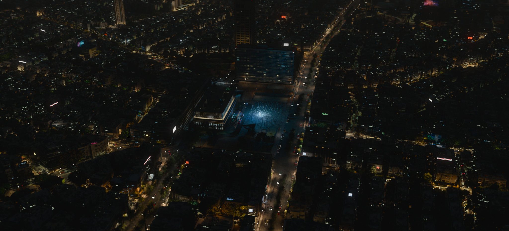
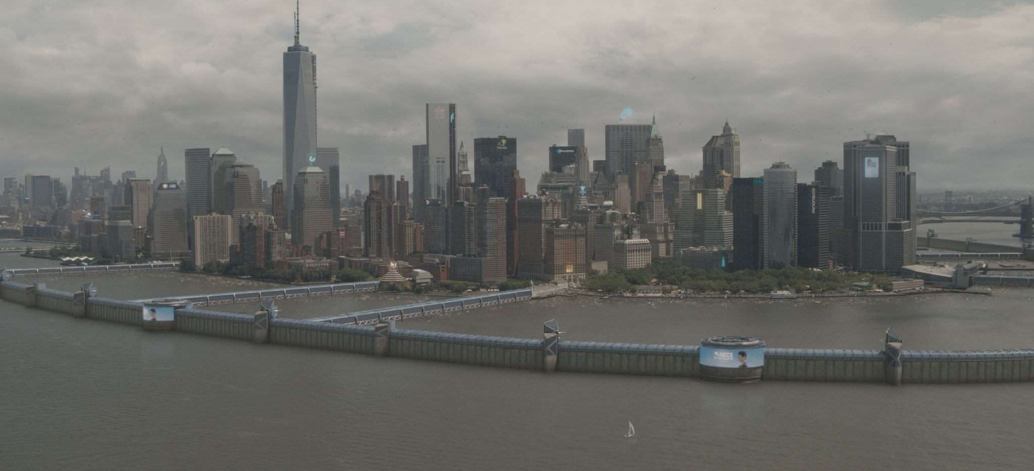
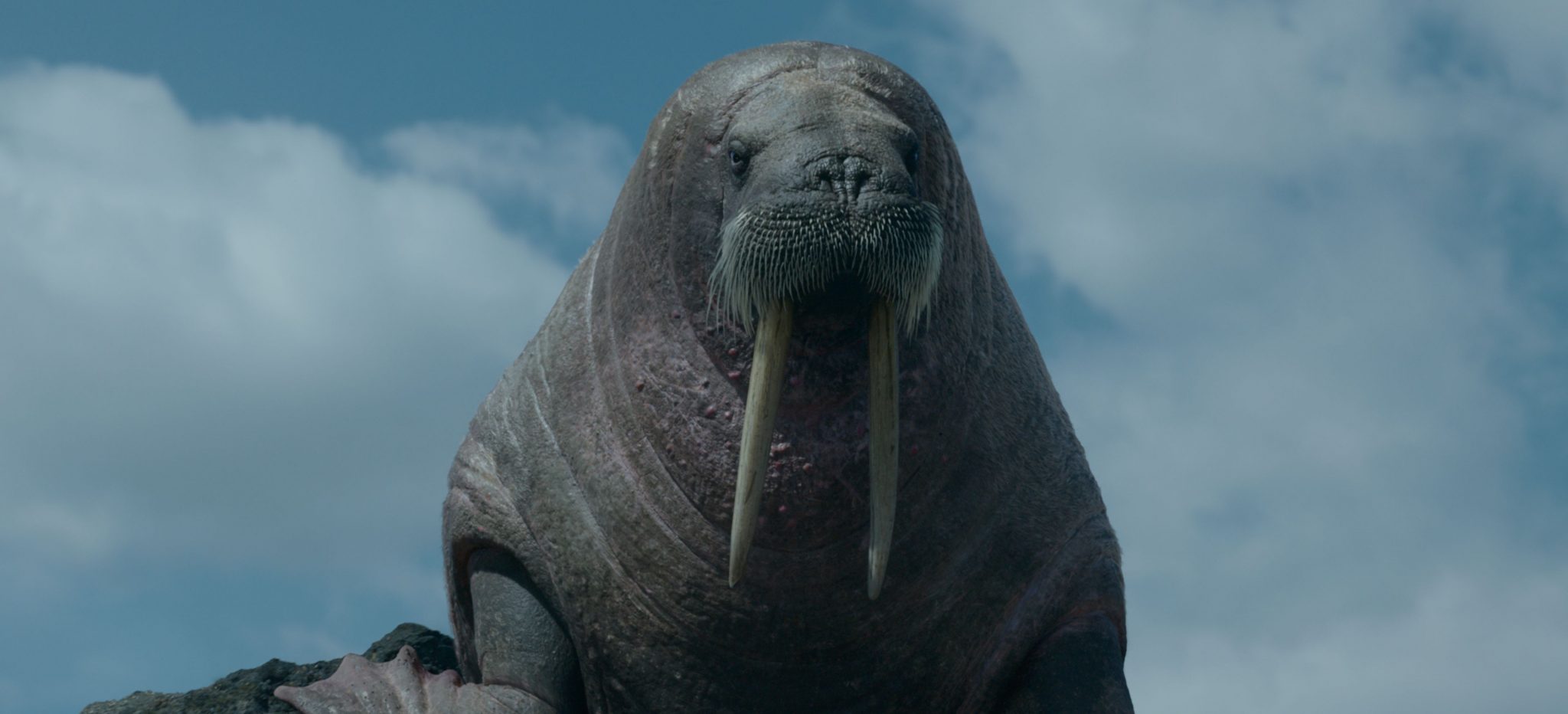
If I have to pick a favourite per episode, I’d say that the sequences with the walruses in episode one, the whale in episode two, the flooded environments in three, the New York seawall in four, the Mumbai aerials in episode five, the floating graphics in episode six, and the bear in episode seven are my top picks.
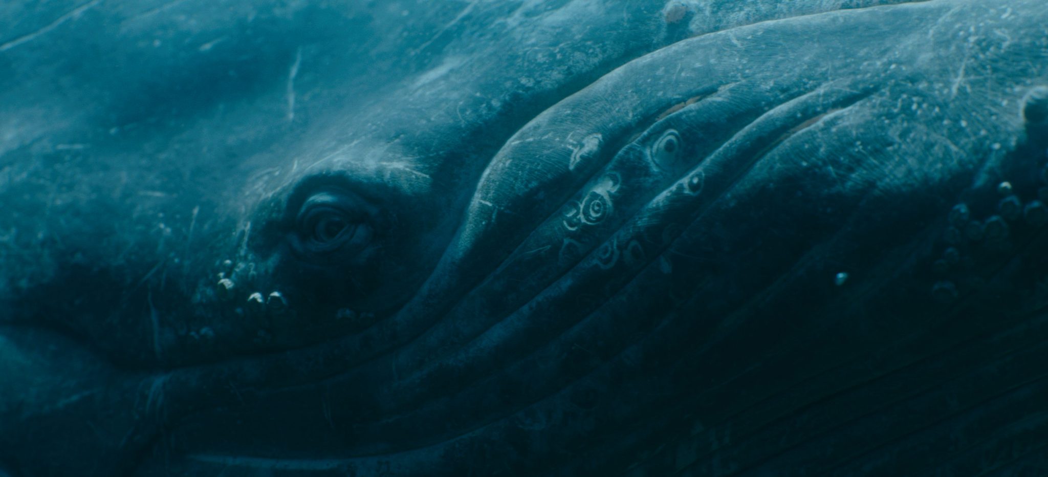
Obviously, I don’t think we have time to develop all of that so I’ll talk a bit about the underwater shots of episode two, which are currently being considered for this year’s Emmys.
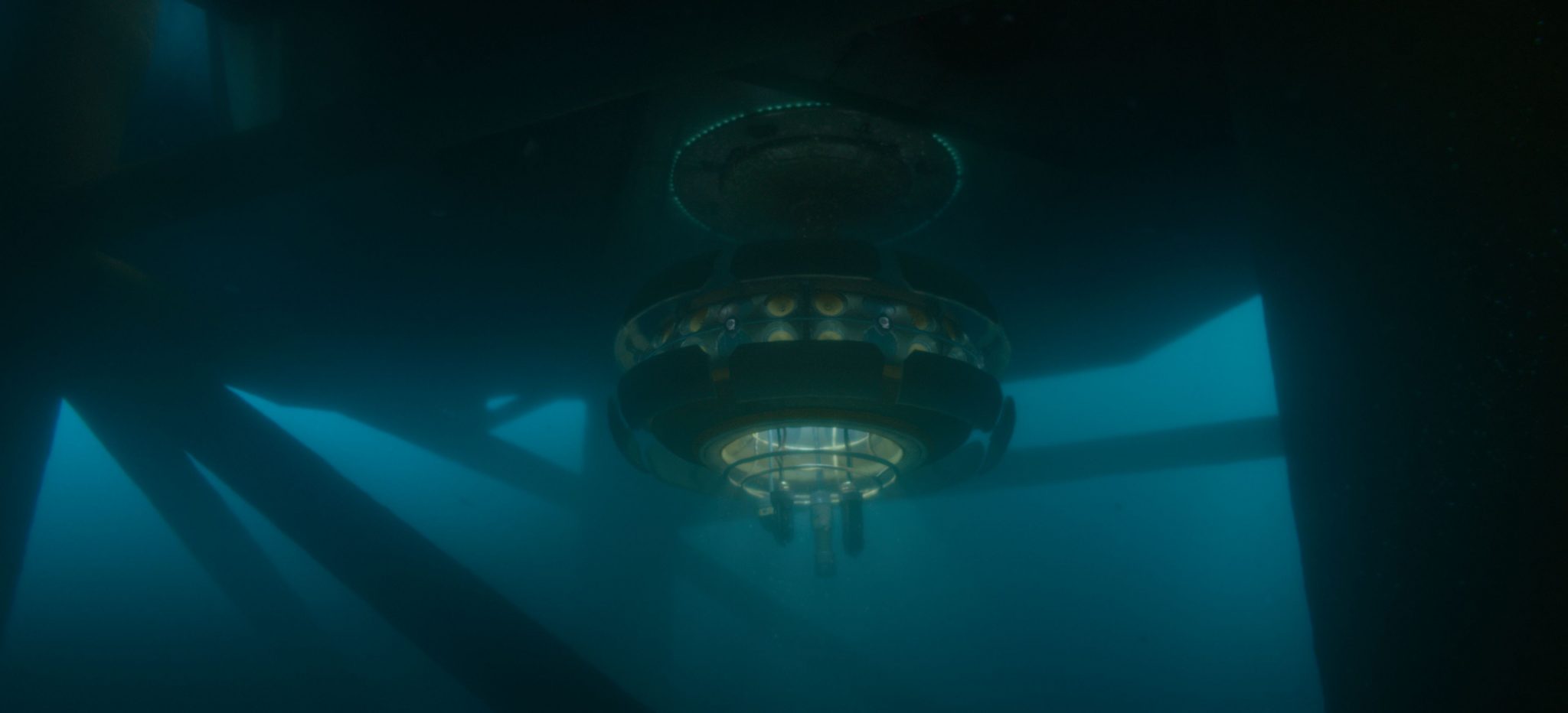
In this episode, Rebecca (played by Sienna Miller) embarks on a mission to communicate with the last whale on Earth from a listening station rig off the coast of Colombia. The AD team built two sets, one above and one below water. So our team started by building the entire rig, extending and connecting both physical sets and therefore allowing us full CG shots.
They had designed the set below water with large windows and blue screens to provide excellent visibility of the underwater environment and the whale. Scott didn’t want this to look like a flat ramp of blue, so when Ashley briefed us, he had already done a concept to decide what and how far they wanted to see. This allowed us to jump directly into developing the look, using a combination of FX, lighting and compositing techniques.
The FX team focused on developing the water canopy, dense clouds of marine snow and clusters of bubbles of various sizes which were placed in key shots. They then used a Python script to automatically determine the position and size of the bubble clusters in the surrounding shots, dynamically adjusting their release for each window.
The lighting team complemented the FX work by setting up a rig of god rays and volumetric lighting to illuminate the underwater CG elements, including the whale and the station. The trick for them was to reach a balance between the creative vision and technical execution, creating a believable underwater atmosphere.
This was obviously beautifully enhanced by the compositing team, who played a vital role in bringing all these elements together. They blended subtle moving shapes in the distance, added extra layers of 2.5D god rays, and created a rich and beautiful water world. Their intricate work ensured that the underwater sequences felt deep and immersive.
Meanwhile, the asset team focused on developing Eve, the humpback whale. Initially designed for distant shots, it became more and more important for the editors to get the camera up close and connect with her. So we did a round two on the asset to push the model, sculpting, and texturing further to allow for such shots. The team paid extra attention to all the intricate details such as the eyes, eyelids, skin, scars, and barnacles, resulting in a realistic and captivating asset. Eventually, this gave Scott more freedom to add extra full CG shots, including the big opening shot of the episode introducing both Eve and deep sea mining.
For their part, the animation team studied tons of videos of whales to ensure Eve was powerful yet graceful. One challenge came from the fact that most of her shots were actually part of dialogue sequences. So Eve and Rebecca had to connect in the shots they shared together onscreen, and matching the eye-lines accurately across the sequences was imperative to maintain the illusion of authenticity. The team did a great job at balancing between keeping her movements natural and fluid, and restricting her in a localised part of the frame
Finally, the MGFX team worked on creating a sophisticated graphical interface for the consoles and smart windows of the station, emphasising the underlying AI technology facilitating communication between Rebecca and Eve and making it believable. They utilised muted colours, waveform monitors, and animated graphics to convey a constant flow of information and enhance the sense of a technical laboratory. And before you ask, as crazy as it sounds, there are indeed people currently using AI to find a way to communicate with whales so I can’t wait to see what we’ll be able to do with that technology by 2046!
All in all, I am very proud of the beautiful work from our various teams on this project. Their collaborative efforts brought these underwater sequences, and many others that are equally as visually stunning, to life. A true testimony to their talent and I hope that the viewers of the show enjoyed the spectacle!
Guy Hancock:
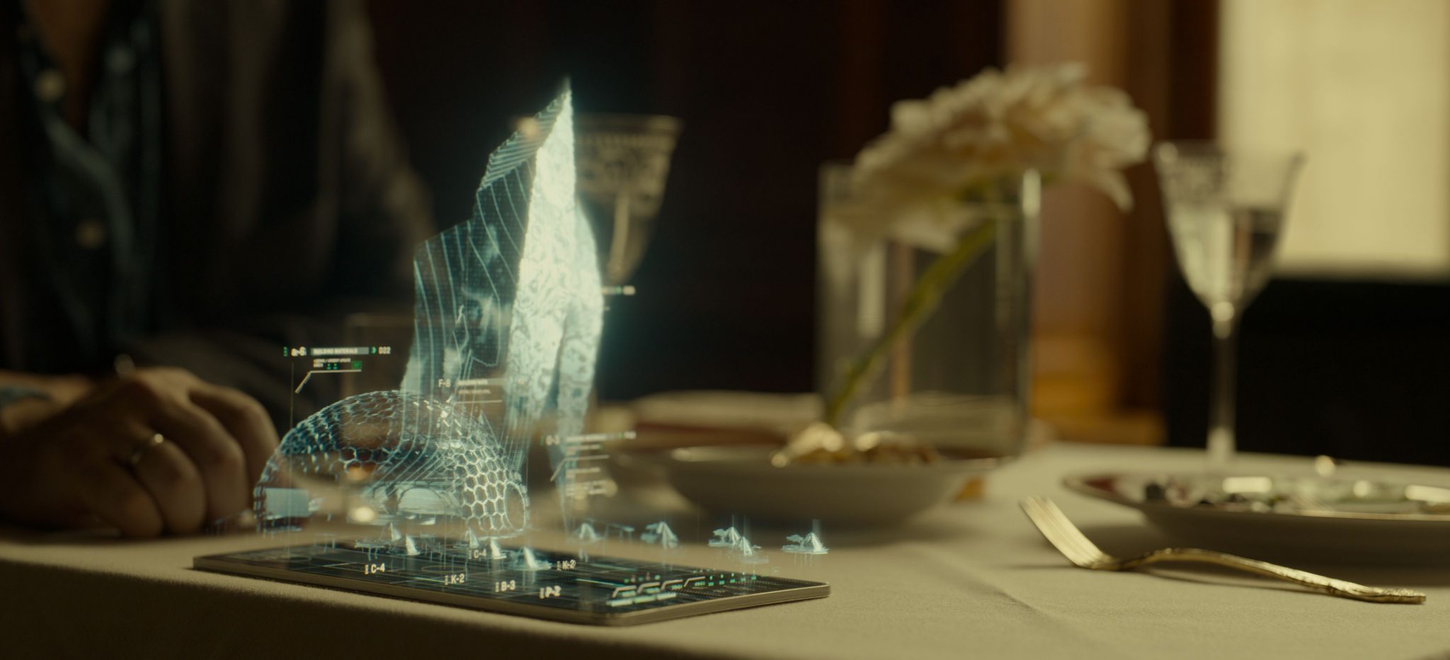
I also have lots of individual graphics and designs that I’m really proud of across all of the episodes in the show, but one that does stand out for me would be the Cache Cloud application seen in episode six. Conceptually, it was a very challenging task to produce an application that could be seen to perform an incredibly complicated process of storing and recalling someone’s memories. It was great fun exploring ideas based on ‘Big Data’ visuals, neural pathways and circuitry which led to really interesting design concepts involving node connections.
We then needed to apply our concept to a variety of applications and interfaces that would be used throughout the episode. There is a holographic user interface portrayed in the ‘vidscreen’, we also see a custom application internally within Ezra’s Bio Link, and then a stripped back 2D app used within the Cache Cloud Flagship store. Despite the multiple settings and uses, the application needed to feel consistent as a brand.
Once the final design had been achieved, there were a number of technical challenges with implementing a fully animated rig that we could use across the platforms and throughout the episode. We were keen to have the Cache Cloud memories feel dynamic, especially when the application was opening and closing, or when the characters were interacting directly with hand gestures.
It took a lot of ingenuity and RnD to finalise a usable setup that had the desired sense of connectivity and allowed for streamlined animation across the episode. Techniques were developed using spline dynamics in 3D, which was then refined and finessed in After Effects where the additional 2D components and memory footage was applied. The sequences were broken into layers so they could be projected into 3D space in Nuke, where the final lookdev took place.
On top of the functioning application, we also needed to design an entire brand to associate with Cache Cloud enterprise including a logo reveal and watermark, Bio Link interface, and store displays. It was a huge task but a really fun one and I think the final result adds a lot to one of the most graphical and visual episodes of the series.


